Asempa to Adwuma (The 2017 and 2018 Ghanaian Budgets)
This post will be on text mining. I will be using the 2017 and 2018 Budget statements of Ghana for this tutorial.This post will not have in-depth explanation of the results of the analysis but rather show how one can perform analysis on documents all around us. I have provided the links to the documents in the next 2 paragraphs hence one can read and compare how they fare with the results obtained in the post.
The Minister of Finance Mr. Ken Ofori-Atta read the 2017 budget on 2nd of March 2017 and the 2018 budget on 15th Nov. 2017.He gave two Twi names for the budgets: Asempa Budget (good news budget) for 2017 and Adwuma Budget (job budget) for 2018.
Many thanks to Citi Fm for making these documents readily available:2017 and 2018.
Import libraries
To start we need to load the necessary packages. All of the packages used in this tutorial do not come with R and RStudio hence they need to be installed.install.packages(readtext)installs the readtext package and its dependencies.
#LOAD IN THE NEEDED LIBRARIES
library(readtext)               # reading pdf files
library(tidytext)               # generating tokens from pdf files
library(tidyverse)              # data manipulation / visualization
library(stringr)                # regular expression
library(wordcloud)              # generating wordclouds
library(gridExtra)              # data visualization
Get the data
Next, I downloaded the files and stored them in variables.Remember to add the file extension: (.pdf) as an error will be thrown when this is excluded.
year2017 <- "2017-BUDGET-STATEMENT-AND-ECONOMIC-POLICY.pdf"
year2018 <- "2018-Budget-Statement.pdf"
Create functions and themes
Before we start exploring what was in the budget readings, let us set up all the themes and functions required for cleaning and shaping the data:
- theme.plot: will be the default theme to be used by all plots. Any additional style for a plot will be included when building the individual plot.
- fxn.wdCount: a function that takes the name of the pdf and returns a dataframe of the count of words (numbers excluded) in descending order.
- fxn.barChart: a function that takes the dataframe of words returned from fxn.wdCount and the year of the budget. It draws a bar chart of the first 20 most occured words.
- fxn.wdCloud: this function takes a dataframe of words and draws a wordcloud of the first 100 most occuring words.
- fxn.sentiYr: function will be used to calculate the total sentiment carried by a document.
############THEME############
theme.plot <-
    theme(text=element_text(family="Kalinga",color="#eeeeee"))+
    theme(plot.background = element_rect(fill="#2b7c85"))+
    theme(plot.title = element_text(size=14, hjust=0.5, face="bold"))+
    theme(panel.background = element_rect(fill="#2b7c85"))+
    theme(panel.grid.major = element_line(color="#fafafa"))+
    theme(panel.grid.minor = element_line(color=alpha('#eeeeee',0.2)))+
    theme(legend.background = element_rect(fill="#2b7c85"))+
    theme(legend.title = element_text(face="bold"))+
    theme(legend.key = element_rect(fill=NA))+
    theme(axis.title = element_text(color="#eeeeee", face="bold"))+
    theme(axis.text = element_text(color="#eeeeee"))+
    theme(axis.ticks = element_blank())


############FUNCTIONS#########

fxn.wdCount <- function(nameOfFile){
            df.year <- nameOfFile %>%
                        readtext() %>%
                        unnest_tokens(word, text) %>%
                        filter(str_detect(word, "^[A-Za-z]+$")) %>%
                        anti_join(stop_words) %>%
                        count(word, sort=T)
            return(df.year)
}


fxn.barChart <- function(df.year, budgetYear){
            ggplot(data=df.year[1:20,], aes(x=reorder(word,n), y=n)) +
                geom_bar(stat="identity", fill="grey") +
                geom_text(aes(label=n), hjust=1.1, color="#595959", fontface="bold")+
                labs(x="", y="", title=paste("NUMBER OF OCCURENCES IN ",budgetYear, " BUDGET")) +
                theme.plot +
                #theme(panel.grid.minor = element_blank()) +
                coord_flip()
}


fxn.wdCloud <- function(df.year){
                    df.year %>%
                        head(n=100) %>%
                        with(wordcloud(word, n, colors=brewer.pal(6, "Dark2")))
}


fxn.sentiYr <- function(df.year){
    df.sentiYr <- df.year %>%
        inner_join(get_sentiments("nrc")) %>%
        count(sentiment, sort=TRUE)
    return(df.sentiYr)
}
Naming conventions
I have a set of naming conventions for functions, themes, dataframes, etc so I can easily recognize them anytime they are needed.For simplicity,functions: fxn.nameOfFunction, themes: theme.nameOfFunction, dataframe: df.nameOfFunction.
Tokenizing the budgets
It is time to analyze the budget statements. First the content for each document is passed to the fxn.wdCount() to be split into a dataframe of words. Remember the names of the documents were passed to 2 variables, these will be the arguments to the function.The output from the function is stored in the variables df.2017 and df.2018. The dimensions(number of columns and rows) and a few rows of the variables df.2017 and df.2018are displayed.
df.2017 <- fxn.wdCount(year2017)
dim(df.2017)
## [1] 5281 2head(df.2017)## # A tibble: 6 x 2
## word n
## <chr> <int>
## 1 ministry 677
## 2 percent 449
## 3 ghana 369
## 4 development 336
## 5 national 318
## 6 government 311df.2018 <- fxn.wdCount(year2018)
dim(df.2018)## [1] 5286 2head(df.2018)## # A tibble: 6 x 2
## word n
## <chr> <int>
## 1 ghana 461
## 2 speaker 434
## 3 percent 416
## 4 ministry 307
## 5 programme 252
## 6 development 249Draw a bar chart of the occurences
There are over 5000 rows of words in each dataframe. A bar chart of the first 20 most occured words is drawn.The function fxn.barChart() comes in handy here. I prefer the use of functions in that, instead of repeating lines of code for each plot, all are bundled into a single function. To use the function, an argument if required is passed and the plot is drawn or the plot passed to a variable if it so requires.
The dataframe of words df.2017 and df.2018 and the year of budget reading are passed to the function.The year of reading is required for giving the plot a title.
fxn.barChart(df.2017, 2017)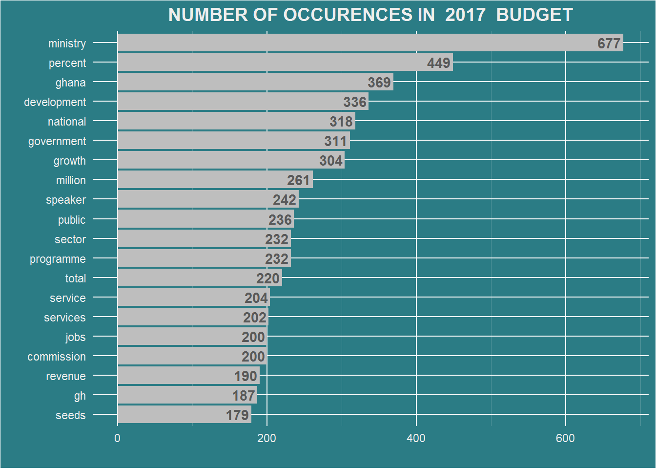
fxn.barChart(df.2018, 2018)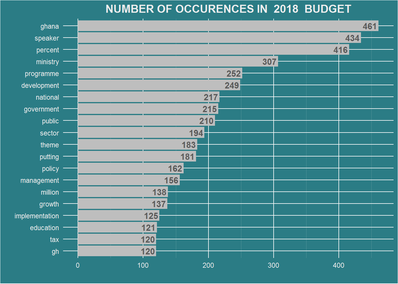
Draw a wordcloud
Next a wordcloud of the first * 100 * most occured words is drawn. The dataframe of words (df.2017, df.2018) are passed as arguments to the function fxn.wdCloud().
fxn.wdCloud(df.2017)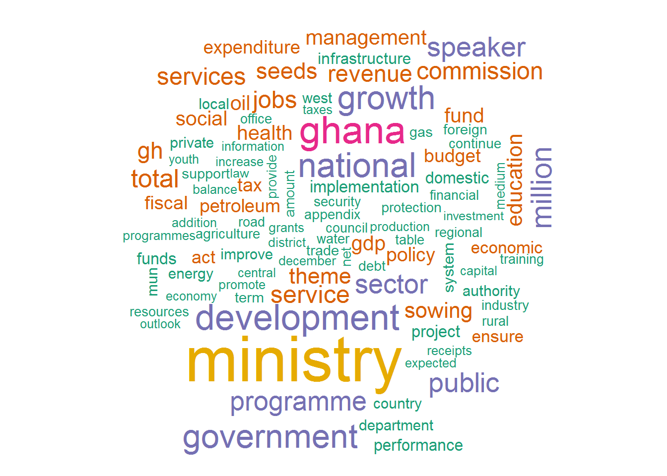
fxn.wdCloud(df.2018)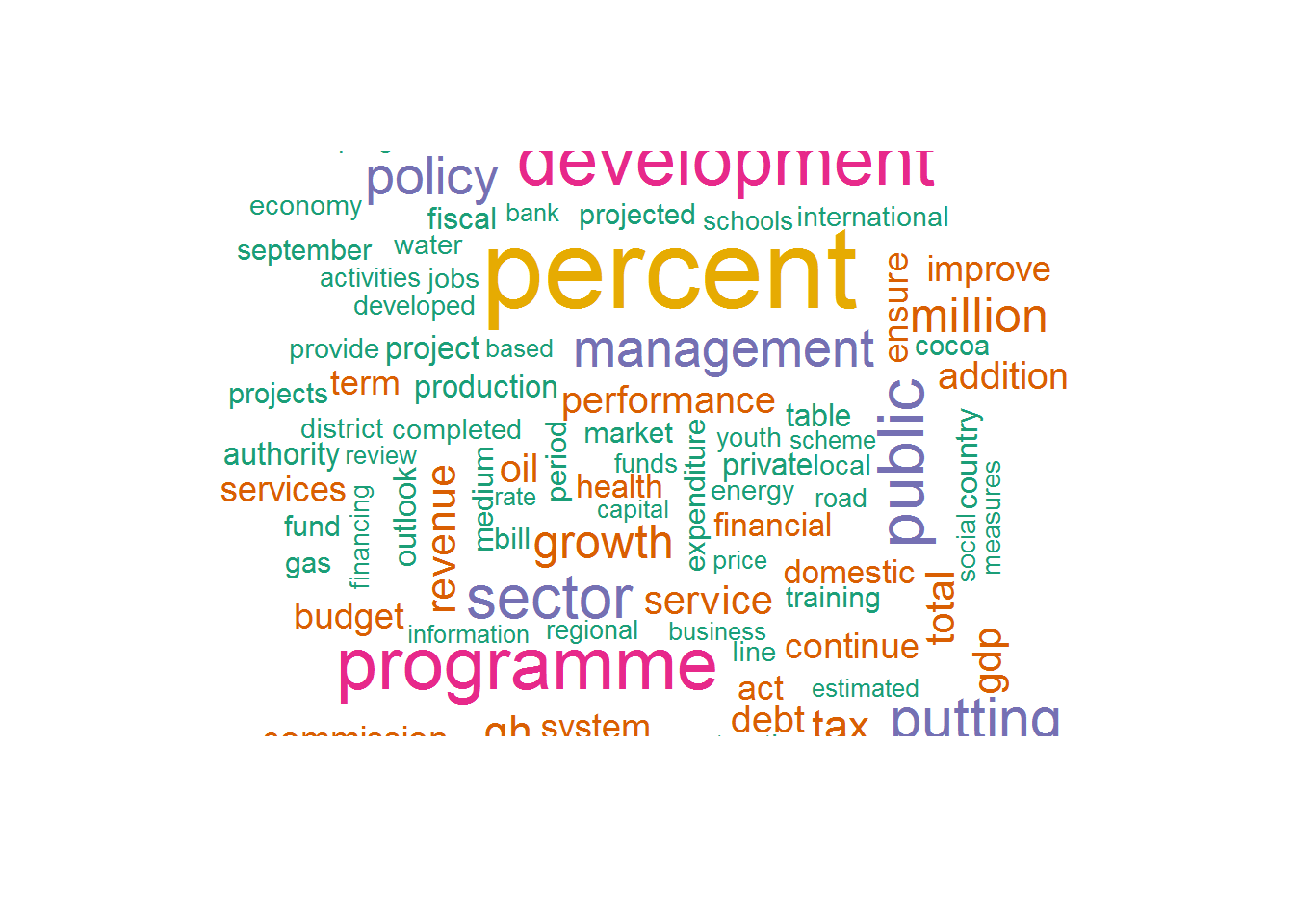 A quick glance shows that the words * ghana, government * and * national * featured prominently in both readings.The function unnest_tokens() returns a dataframe of words in lowercase by default hence * Ghana * is displayed as ghana.
Sentiment analysis of the budgets
I am interested in knowing the sentiments underlying the budget reading. The sentiment of the entire reading is the sum of sentiment score associated with each word.
The sentiments dataset
There exists a dataset:sentiments in the tidytext package that helps to calculate the sentiment carried by a word. The dataset is made up of 4 columns: word, sentiment,lexicon,score
## # A tibble: 27,314 x 4
##    word        sentiment lexicon score
##    <chr>       <chr>     <chr>   <int>
##  1 abacus      trust     nrc        NA
##  2 abandon     fear      nrc        NA
##  3 abandon     negative  nrc        NA
##  4 abandon     sadness   nrc        NA
##  5 abandoned   anger     nrc        NA
##  6 abandoned   fear      nrc        NA
##  7 abandoned   negative  nrc        NA
##  8 abandoned   sadness   nrc        NA
##  9 abandonment anger     nrc        NA
## 10 abandonment fear      nrc        NA
## # ... with 27,304 more rows
There are over 27,000 words in the sentiments dataframe and 4 sentiment lexicons in the dataframe. We can retrieve a single lexicon for use with the get_sentiments("nrc"/"afinn"/"bing","loughran").In this tutorial, we will be using the nrc lexicon. Each word is assigned to either 1 or more of 10 emotional categories: trust, fear, negative, sadness, anger, surprise, positive, disgust, joy and anticipation.
In the code below, the score of each word found in the nrc lexicon is obtained and the scores for each category is summed up.inner_join() from the dplyr package which has been bundled into the tidyverse package is used to get words in our dataframe that also exists in nrc lexicon.
Calculate sentiments for document
We pass df.2017 and df.2018 to the function fxn.sentiYr() and show the first few rows
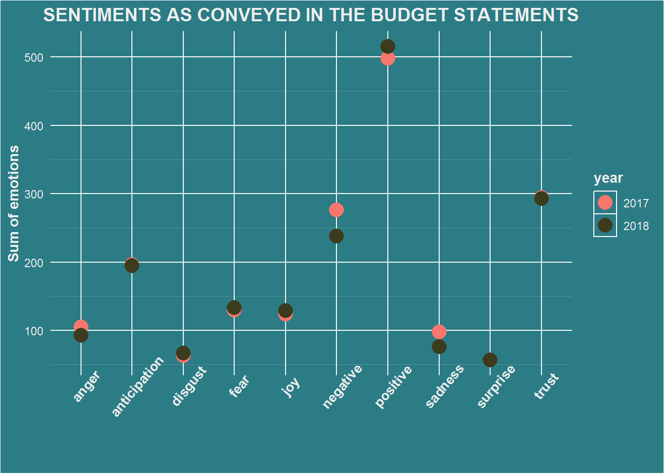
senti.2017 <- fxn.sentiYr(df.2017)
senti.2017
## # A tibble: 10 x 2
## sentiment nn
## <chr> <int>
## 1 positive 498
## 2 trust 294
## 3 negative 276
## 4 anticipation 196
## 5 fear 130
## 6 joy 124
## 7 anger 105
## 8 sadness 98
## 9 disgust 63
## 10 surprise 57senti.2018 <- fxn.sentiYr(df.2018)
senti.2018## # A tibble: 10 x 2
## sentiment nn
## <chr> <int>
## 1 positive 515
## 2 trust 293
## 3 negative 238
## 4 anticipation 195
## 5 fear 133
## 6 joy 129
## 7 anger 93
## 8 sadness 76
## 9 disgust 67
## 10 surprise 57Plotting the sentiments of the document
It will be interesting to see how the sentiments vary per year. Since the values are numeric as against categorical sentiments values, it is appropraite to use a scatterplot. ### Dataframe of scores First, a dataframe of sentiment scores for 2017 and 2018 is created using bind_rows(). A new column year is created and the year from which the data is from is used as the row name for each category score.
# combine the years into a dataframe
df.ttSenti <- bind_rows("2017" = senti.2017, "2018" = senti.2018, .id="year")
df.ttSenti
## # A tibble: 20 x 3
## year sentiment nn
## <chr> <chr> <int>
## 1 2017 positive 498
## 2 2017 trust 294
## 3 2017 negative 276
## 4 2017 anticipation 196
## 5 2017 fear 130
## 6 2017 joy 124
## 7 2017 anger 105
## 8 2017 sadness 98
## 9 2017 disgust 63
## 10 2017 surprise 57
## 11 2018 positive 515
## 12 2018 trust 293
## 13 2018 negative 238
## 14 2018 anticipation 195
## 15 2018 fear 133
## 16 2018 joy 129
## 17 2018 anger 93
## 18 2018 sadness 76
## 19 2018 disgust 67
## 20 2018 surprise 57Scatterplot of scores
We will use the scatter plot to illustrate how the scores for sentiments vary according to the category of emotions.They are colored based on the year from which the score was obtained.
df.ttSenti %>%
    ggplot(aes(sentiment, nn, color=year)) +
    geom_point(size=5) +
    ggtitle("SENTIMENTS AS CONVEYED IN THE BUDGET STATEMENTS") +
    labs(x="", y="Sum of emotions") +
    theme.plot +
    theme(axis.text.x = element_text(angle=50))+
    scale_color_manual(values=c("#f8766d","#3c3b1d"))+
    theme(axis.text.x=element_text(size=10,face="bold"))